This project was about redesigning the packaging and label of TINE’s iced coffee, improving sustainability, usability, and product positioning.
Project details
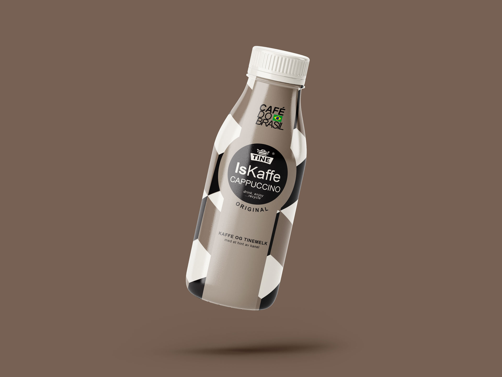
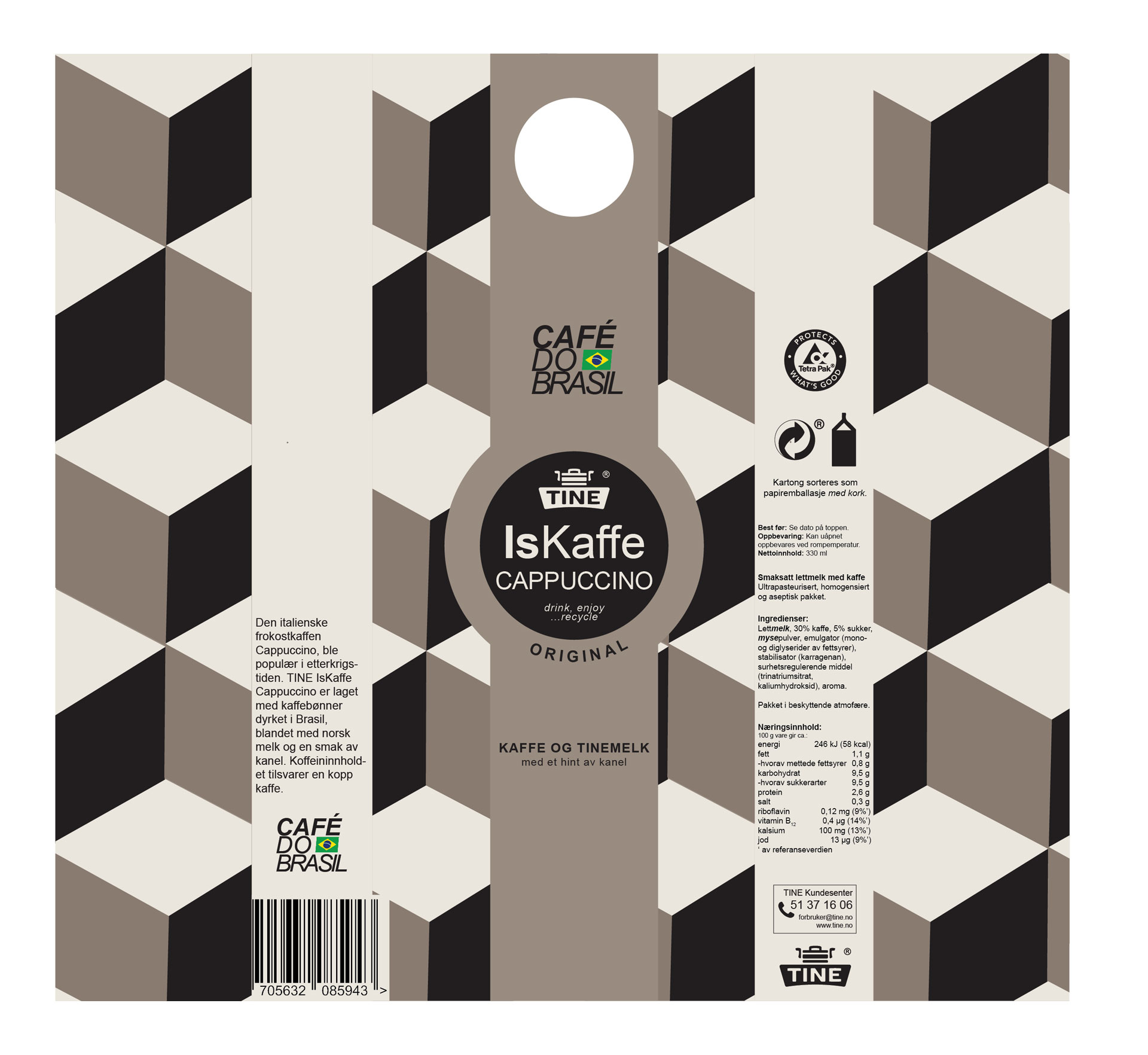
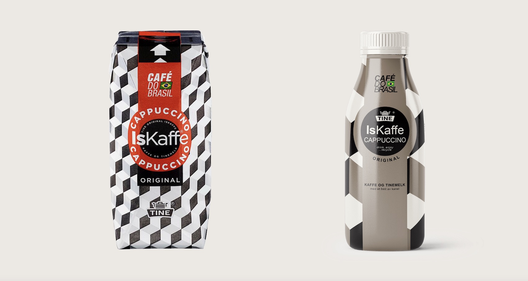
I chose to redesign TINE’s IsKaffe based on its potential for improvements in user experience and sustainability. Changes included a natural coffee-brown color palette, a resealable screw cap for easier use, and a cleaner layout for improved readability.
Concept
Generous spacing and clear typography enhance the packaging’s modern, friendly look, while clarifying recycling information and essential product details to make it easier for consumers to understand.